How to Solve Web Accessibility Issues Arising from Dim Font Colors
We analyze the negative impact of dim font colors (#666 or lighter) in blog skins on Web Accessibility (WCAG) and Search Engine Optimization (SEO). We present practical readability improvement methods to optimize font colors by overriding the CSS `!important` attribute. Enhance user experience and boost SEO scores by increasing color contrast.
How to Adjust Font Colors for Search Engine Optimization (SEO) and Accessibility Improvement
When using default skins on blog platforms like Tistory or WordPress, a significant issue often arises regarding font color. Specifically, problems occur within the [ Font Color Optimization ] standards. Using a default skin as-is often triggers warnings in SEO and accessibility tools. The reason for this is that the font color is pointed out as being too dim. What is even harder to understand is that many skins set the default font color to #666 or lighter and forcibly apply `!important` to these styles.
Why Use `!important`? (Technical and UX Analysis)
Why specify colors this way? What is the rational reason for insisting on dim colors (#666 or lighter) that cause accessibility issues and make reading difficult for users with poor vision?
`!important` style rules take precedence over all other styles. They serve to forcibly maintain the style intended by the developer.
Is there a valid reason to use `!important` to ensure that even if a user tries to change the color, it reverts to a dim tone? We must not overlook the fact that such dim font colors always cause web accessibility problems and make it significantly difficult for users with low vision to read.
When specified this way, no matter how much a user tries to customize their style, the default style is forced upon them. This results in the following issues:
- Decreased Accessibility: Causes discomfort for users with poor vision or weak color perception and leads to potential violations of WCAG 2.1 guidelines.
- Reduced Readability: Makes it difficult to read for long periods, lowering the delivery of content and increasing user bounce rates.
- SEO Penalization: Since search engines highly value User Experience (UX), poor font readability can result in lower SEO scores.
While the technical reasons for using `!important` in default styles might be as follows, they are not desirable from a UX perspective:
- Maintaining Design Consistency: Preventing users from arbitrarily changing styles to preserve the layout intended by the skin creator.
- Considering Diverse Browser Environments: Ensuring consistent output results even in exceptional circumstances.
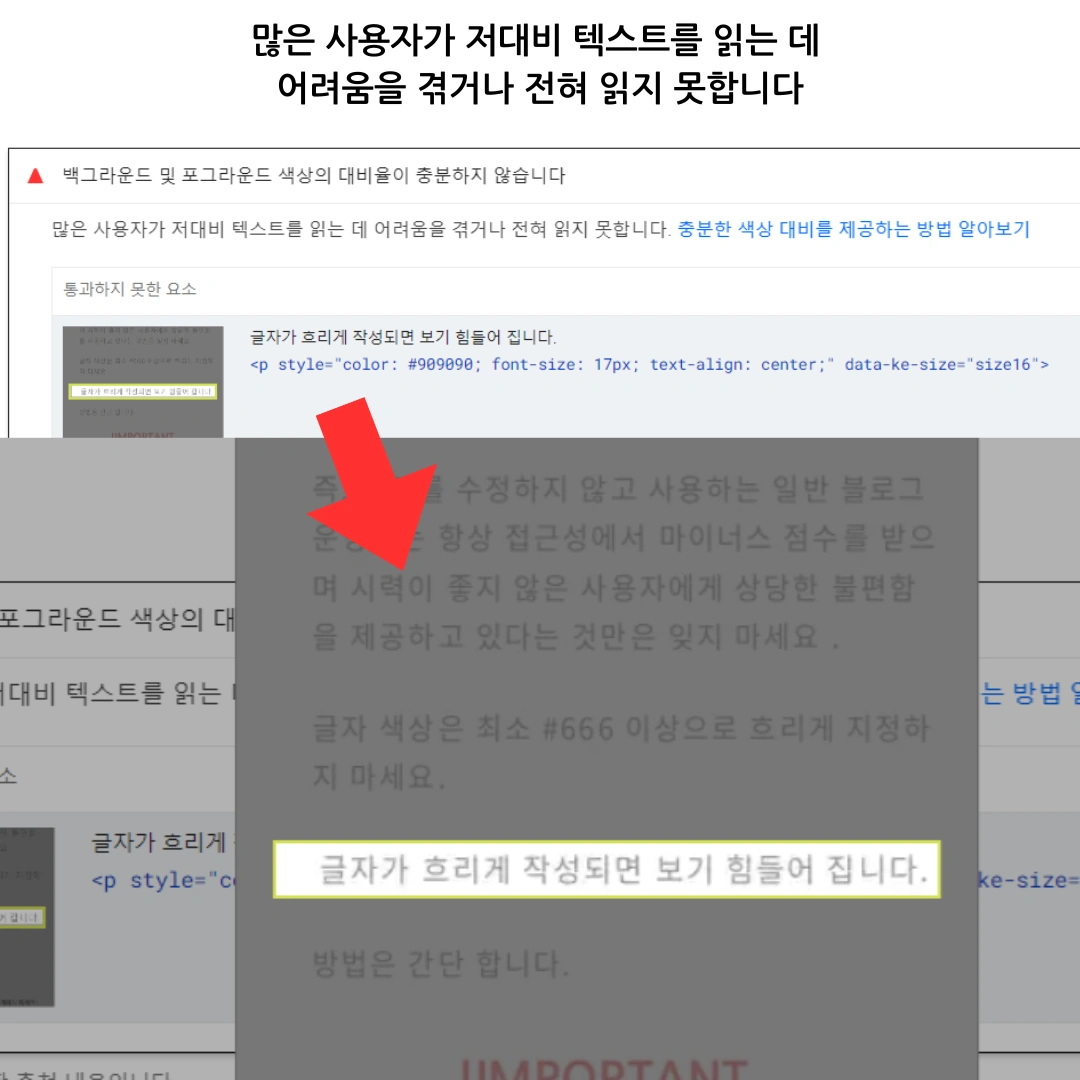
The Web Content Accessibility Guidelines (WCAG) recommend that the color contrast between text and background should be at least 4.5:1. Dim gray (#666 or lighter) fails to meet this standard, making it difficult for users to consume even the most well-written long-tail keywords.
Do not set the font color lighter than at least #666. For example, text in #909090 has very low readability.
Optimizing Font Color and Improving Contrast Using CSS
How to Forcibly Change Dim Font Colors
There is no need to worry even if the default skin has `!important` attached. You can solve this problem by utilizing the principles of CSS Specificity and Declaration Order. Simply specify the desired color for the problematic font color at the bottom of your CSS file. Even if a style has `!important`, the identical `!important` style declared last will be the one finally applied.
By writing the code below at the very bottom of your CSSthe last part of your skin editoryou can successfully override the default styles.
/* Example of font color optimization: Ensuring accessibility by increasing contrast */
#content, .article-content, p, span, li, div, body {
 color: #222 !important; /* Deep colors like #222 or #333 are recommended */
}
You can prioritize and apply the default color by using `!IMPORTANT`. This method fundamentally solves readability issues.

Recommended Color Combinations and Contrast Examples
| Text Color | Background Color | Contrast Result | Recommendation |
| #222 (Dark Gray) | #ffffff (White) | Excellent (Meets WCAG) | ●●●●● |
| #333 (Medium Gray) | #f9f9f9 (Very Light Gray) | Appropriate (Meets WCAG) | ●●●●○ |
| #999 (Dim Gray) | #ffffff (White) | Low (Fails WCAG) | ●○○○○ |
Final Summary (Accessibility and SEO Perspective)
- The dim font color of default skins is a triple threat, causing poor readability, SEO disadvantages, and web accessibility issues.
- While it seems difficult to modify due to the `!important` attribute, it is entirely fixable through the CSS bottom-override method.
- It is best to use dark colors of at least #444 or deeper to ensure proper contrast.
- Color contrast must align with WCAG accessibility guidelines; darker font colors improve user experience, leading to better search engine evaluations.
Q1. Does color contrast directly affect SEO?
A1. Color contrast itself is not a direct ranking factor. However, it is a core metric of Web Accessibility, and Google places high importance on User Experience (UX). If low readability causes user discomfort and leads to site exit, dwell time decreases and bounce rates increase, indirectly negatively impacting SEO scores. In short, good contrast creates good UX, and good UX contributes to SEO optimization.
Q2. Is it best to set all text to #000 (Black)?
A2. While pure black (#000) provides the highest contrast, it can increase eye strain when paired with a pure white background (#FFF). Therefore, experts generally recommend using dark grays like #222, #333, or #444 to maintain high contrast while ensuring eye comfort. This is especially useful for long-tail content designed for extended reading.
Q3. Can I solve contrast issues by increasing the font size?
A3. WCAG guidelines vary contrast requirements based on font size. While standard text requires at least 4.5:1, large text over 18pt (24px) only needs to meet a 3:1 ratio. Thus, increasing font size can be a partial solution, but it is fundamentally most desirable to adjust the text color to a darker shade to ensure readability for all text.